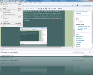
Ok, I’m writing an extremely short review of Windows Live Writer, Microsoft’s new blog post writer/editor. This is to my surprise a windows client (program) so it isn’t like blogger’s web editor. So you can write a post in the (relative) comfort of your Windows (which means greater screen space, easier formatting and object manipulation, and other offline extras) and publish directly to say, your blogger blog. Yeah, you’ve read it right, it works with Blogger, WordPress, TypePad, Windows Live Spaces, Share Point blog and other blog providers. This is, to be quite honest excellent.
Lets start with the good sides of this application.
Firstly, it lets you format text easier and that feature is more bug free than blogger editor (I’m only familiar with that one, others I know only very superficially). Inserting pictures is very ms word-like. That means you can of course add pictures from files (which can be saved to your blog host or some other site via ftp, all automatically) but you can add pictures (and other objects) from clipboard as well. Besides images, you can easily and directly add tables (which you can easily edit), photo albums (needs Live ID though), MS Virtual Earth maps (as demonstrated below), movies (offline, online, youtube [1])and tags or other objects by downloading plug-ins. Every object which you add is very customizable which is a nice surprise. So you can add shadow effects to your pictures, change sizes, add watermarks, crop, tilt, add standard post processing effects etc.
Blog management is good too. You can have multiple blog accounts and Live Writer (or is it just Writer?) can manage them all very easily and efficiently. That means you have full control about your blog accounts, your blog posts are easy and fast to edit etc. There are other small details which only make your life much more easier. You can always preview your full blog (including the post you were currently editing) so you can always see how it all fits together even before the current post is finished. Of course, you can see the html source too. Too bad you can’t split the window to Edit and Source (like in Dreamweaver) but very few people will won’t sleep because of this.
So what are the the downsides of this program?
To be honest there aren’t many, which may come as a surprise to some. First what you notice when using this program is there seems to be a delay when you hold down your backspace key so you sometimes delete more text than you intended to. I hope this problem will be solved in the future though. It is not that annoying but you can used to it very fast. Next problem what you notice is the interface. Well, it is not bad at all, but I somehow expected a bit more, especially after the Office 2007 interface (which was a step in right direction). This time some of the commands are transplanted to the right part of the screen (which is a good thing in theory anyway, because it uses wide screen monitors more efficiently), but there are left large gaps in the top tool bar as you can see from one of the images below. Moreover, wouldn’t be great if the right sidebar has the same graphical style as Office 2007 ribbon? Then you have some other waste of screen real estate in the lower part of the screen as demonstrated on the screenshot. Finally, there is no quick way of changing fonts like you have in say MS Word. You don’t have a drop down list (even though there is plenty of space in the interface to add it), but you have to click an icon to open a font browser. Hey, 1995 called and they want their font browser back. And yes, publishing mini window could be better integrated in the existing interface too.
This are almost minor criticisms, and the application is very easy to use but not dumbed down and cut in useful features just for the sake of simplicity (I’m looking at you Apple!). This application proves that you can have simple to use program and have somewhat powerful features in it as well. This cannot be said for many os x applications sadly. Obviously there are many different teams in microsoft corporation. Some of them write crap products (or usually parts of the products) like the team which made Windows Network and Sharing Center for Vista/Win7 (or stone age carvers who made Paint.net, but don’t get me started) and then you have some other teams which write programs which are well build, almost perfectly polished, easy to use, tweakable, and most important of all, usable from day to day. This part of Microsoft I have no problem in admitting that I prefer and like.
Update: The program has a nasty habit of reverting the font typeface to Trebuchet even if you set for example Verdana for your post. This is easily corrected when you write the post and ctrl+a – format – font – verdana. It would be even better if font menu has a keyboard shortcut (preferably the same as ms word). Another thing which should be great is saving drafts to the blog site by default. Default is saving a local copy which is admittedly faster but less convenient. And yes, UI should have been done more logically.
[1] You can even upload movies to youtube directly.


No comments:
Post a Comment